
Mobile-First Strategy
Why designing for mobile first is no longer optional — it's essential for digital success.
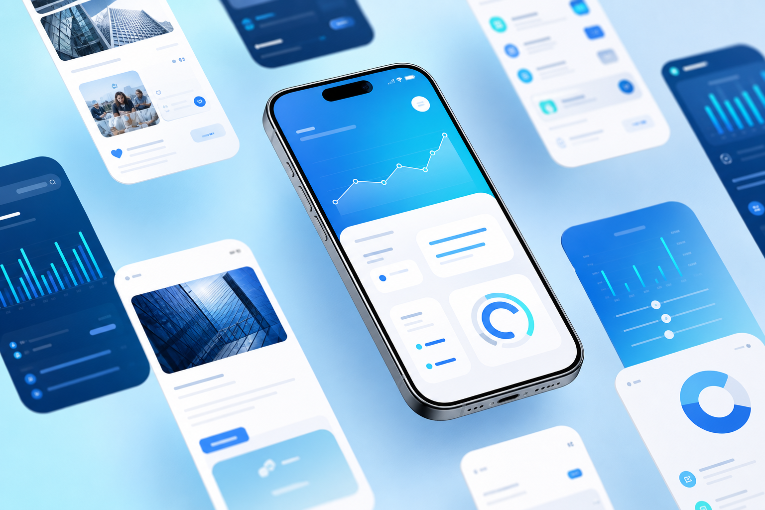
Most digital journeys now begin on a phone. If your product feels slow, cluttered, or hard to tap on a small screen, users leave — even when the desktop experience is excellent. A mobile-first strategy flips the design process: start with constraints, then expand to larger screens.
Mobile-first does not mean mobile-only. It means prioritizing the essential user flows — signup, checkout, booking, support — so they work with thumb reach, variable network speeds, and short attention spans. Progressive enhancement then adds richer layouts for tablet and desktop.
Performance is part of the strategy. Lightweight assets, responsive images, efficient APIs, and careful JavaScript budgets keep pages usable on mid-range devices. Accessibility also improves when you design for touch targets, contrast, and clear hierarchy from the start.
For marketing and SEO, mobile experience directly affects rankings and conversion. Google’s mobile-first indexing and Core Web Vitals make responsive, fast experiences a growth requirement — not a polish task for later.
Razobyte builds websites and apps with mobile-first UX, performance, and conversion in mind. From wireframes to production, we ensure your product feels intentional on every screen size your customers actually use.